
India/
Work/ LUV CUT LET
LUV CUT LET
LUV CUT LET
No Drama, Only Cutlets
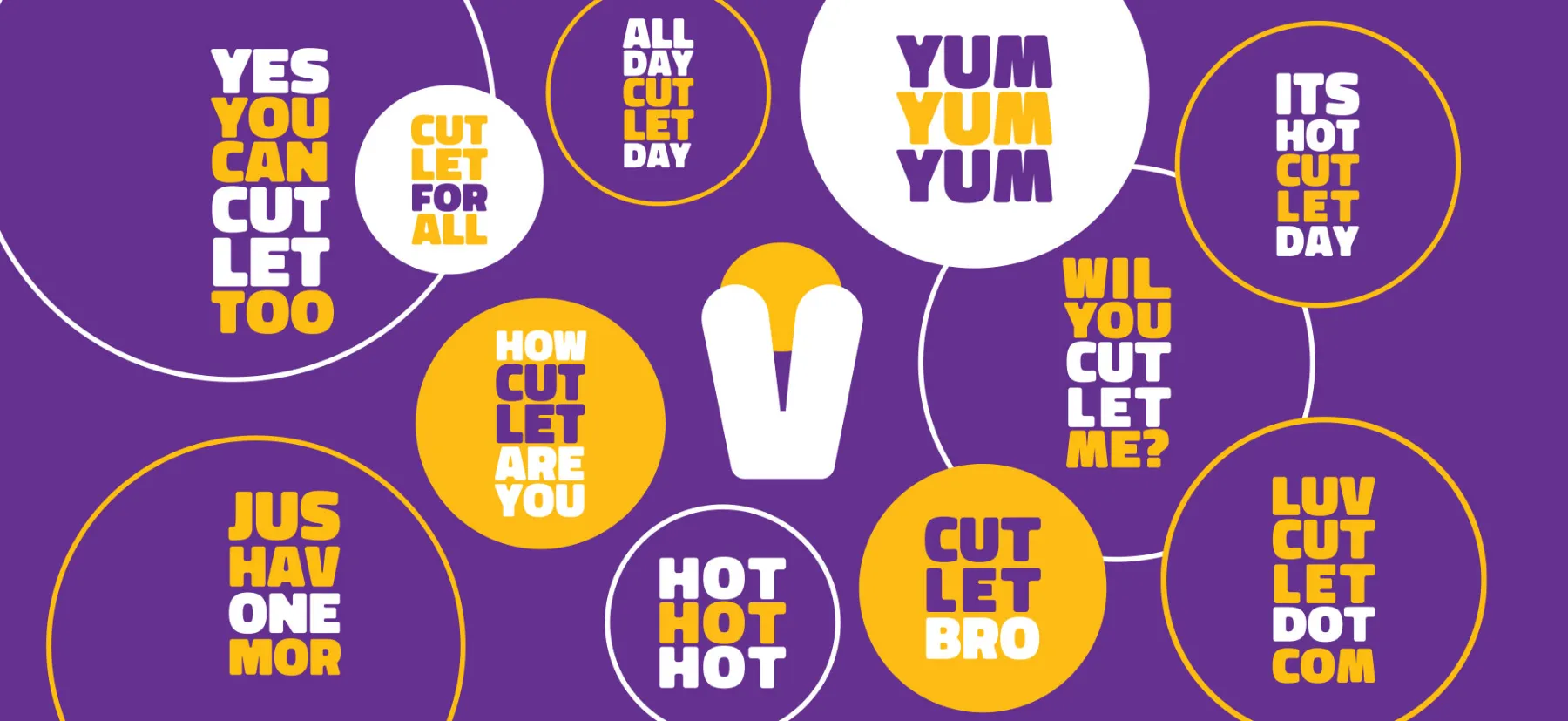
The name ‘LUV CUT LET’ was chosen for evoking associations with love for cutlets and social evening culture. The first three letters of the brand name act as an acronym for ‘Luvin’, the person behind the brand. Luvin first had the idea for the company when he looked for his favourite cheesy evening snack, prawn cutlets made by his mom at home and realized the social hangout communities that have settled in urban areas are extraordinary and largely untapped source for exploring new tastes.
Pixpil developed a visual identity, brand strategy and positioning for LUV CUT LET that reflect its empowering mission and the bold flavours and varieties of cutlets. The flexible system can expand and evolve with the company as it grows.
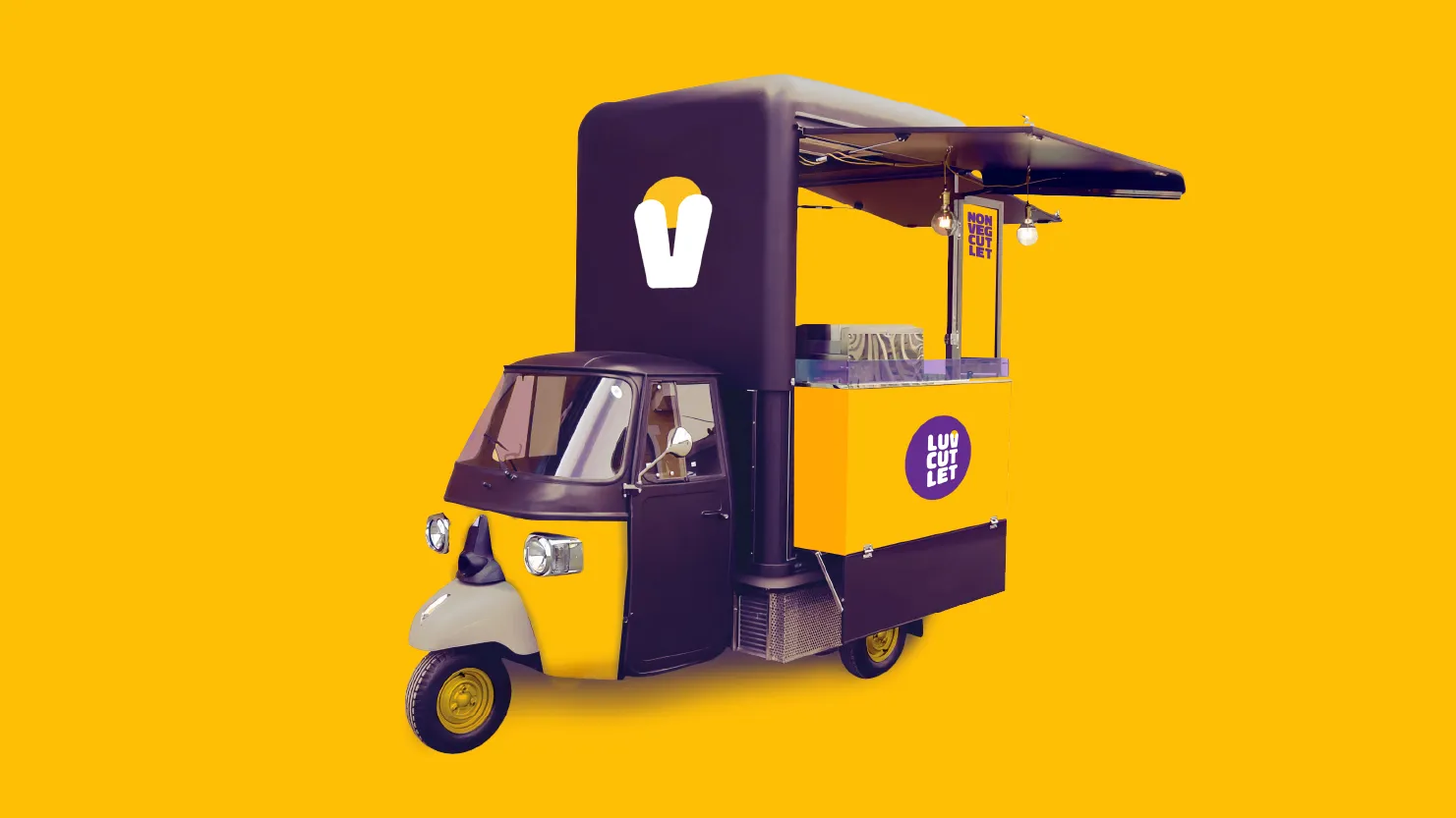
This is captured in the positioning, which describes the company’s offer as
“Street Homecooking”
bringing the best home-cooked cutlets to streets near you and served hot.

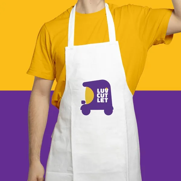
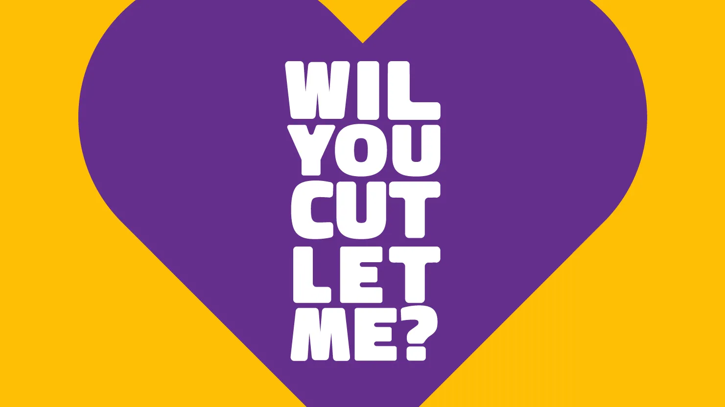
The visual identity combines a playful colour palette with an eye-catching brandmark inspired by the cafe’s selling platform, an autorickshaw which is a common mobility solution in India.
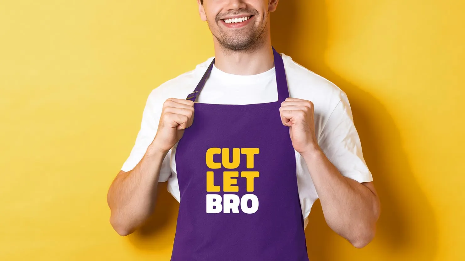
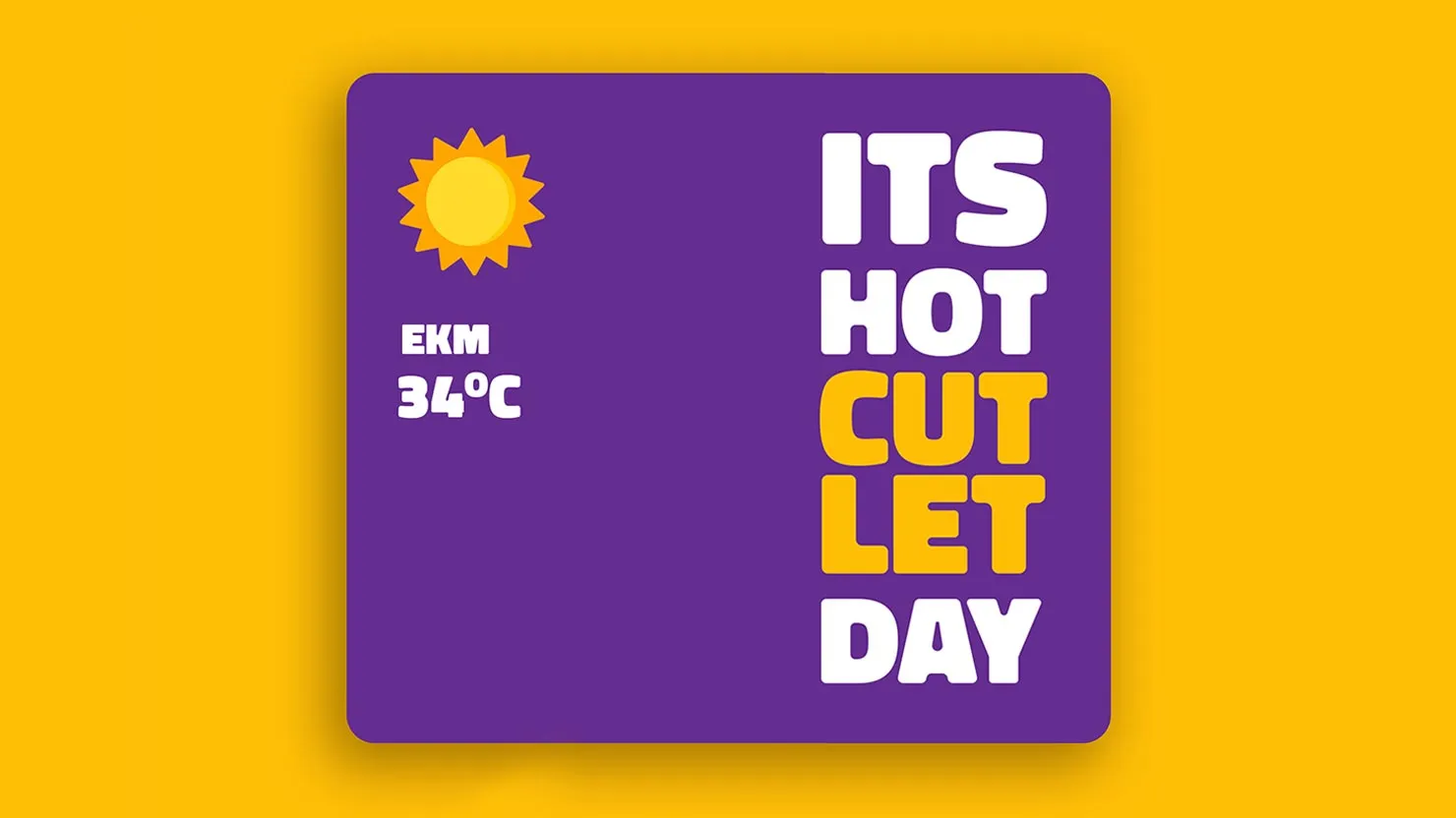
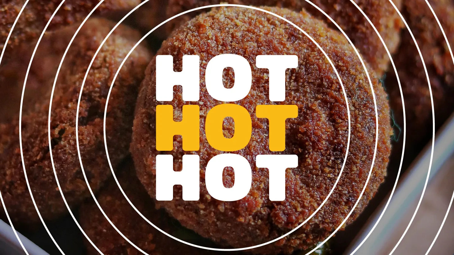
We created a 3 letter brand communication conceptualized from the 3 wheeler idea. The ‘3’ letter brand communication is elevated and underlined, turning it into an ownable graphic detail and adaptable Package copy, which can be added to a wide variety of playful words across the identity.
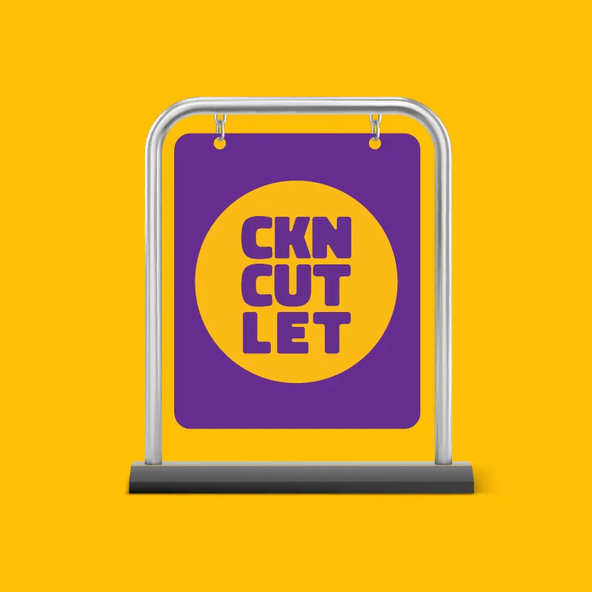
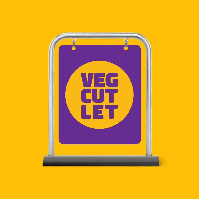
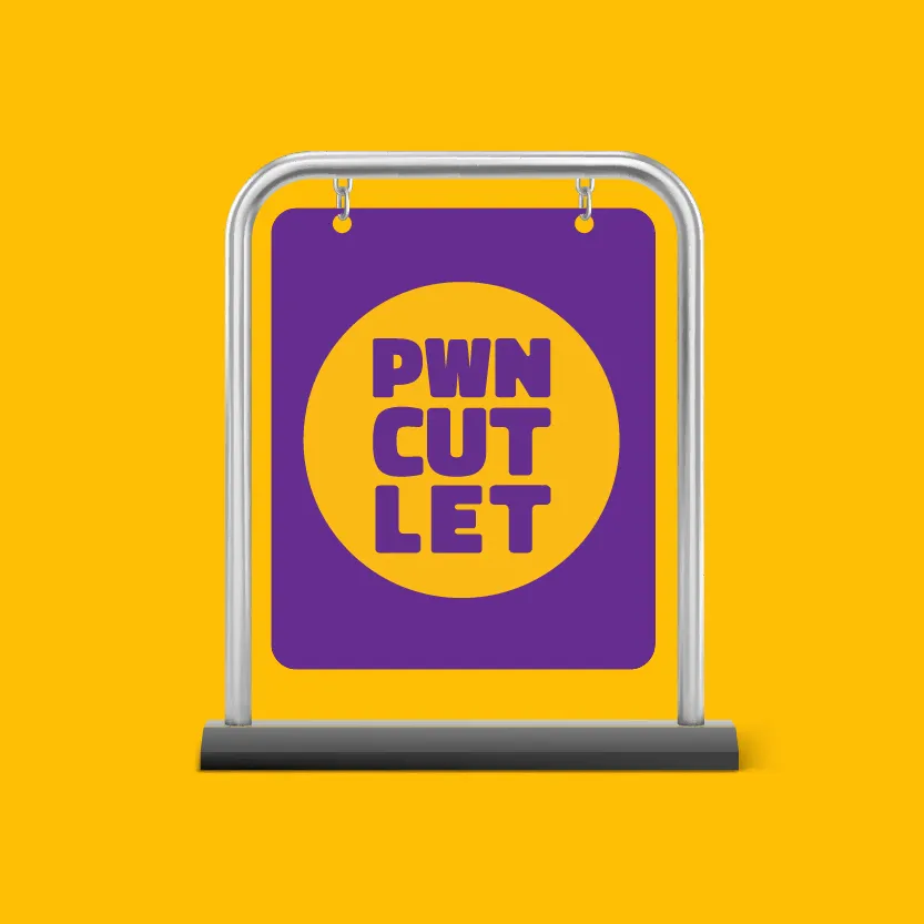
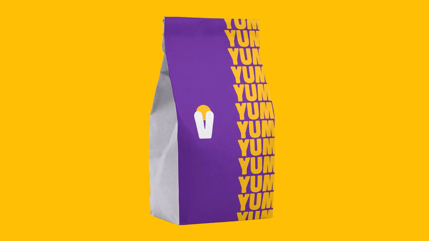
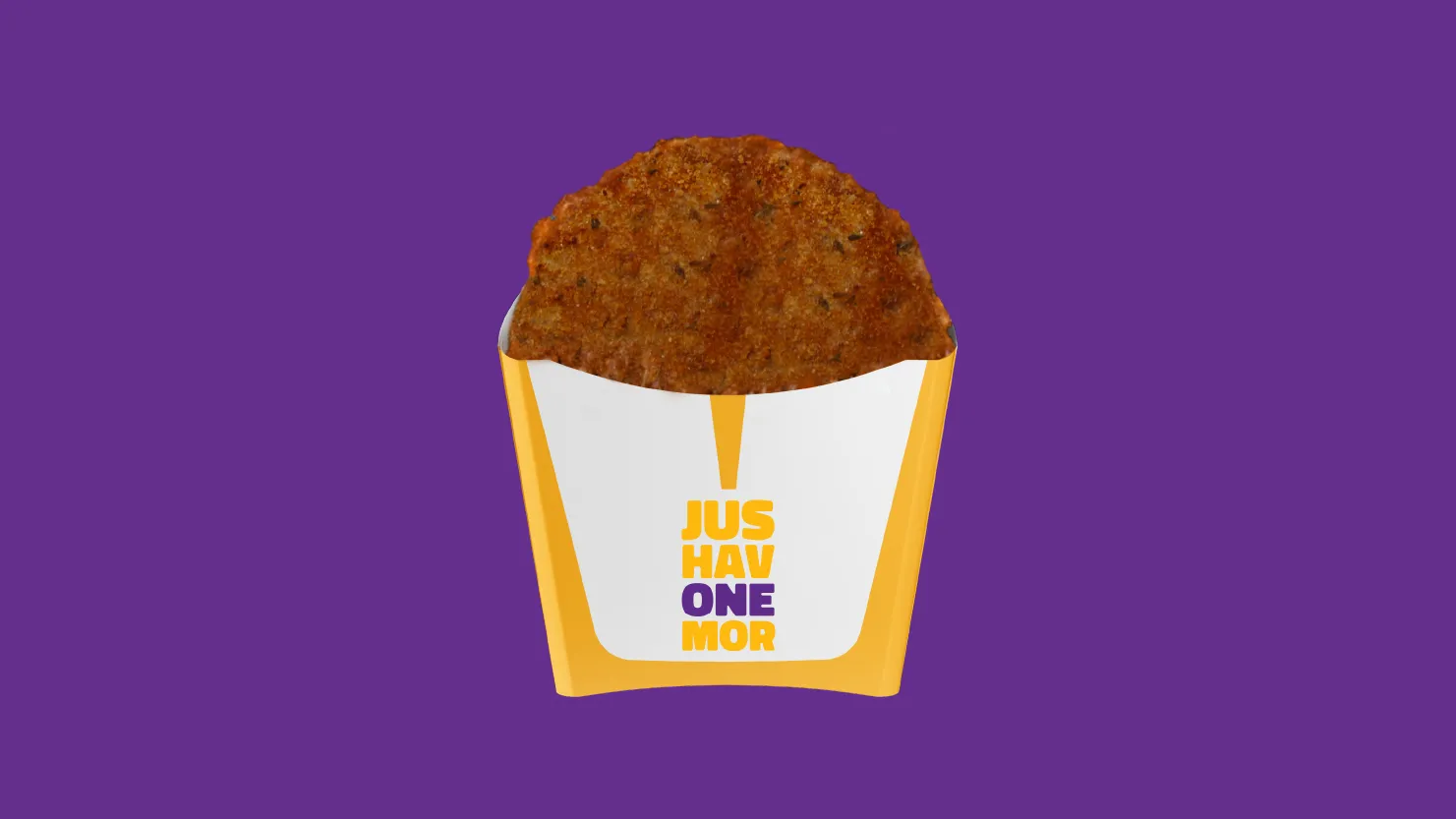
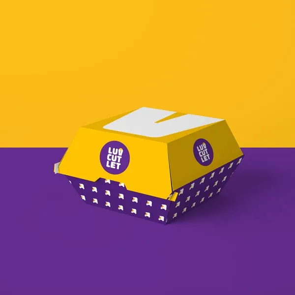
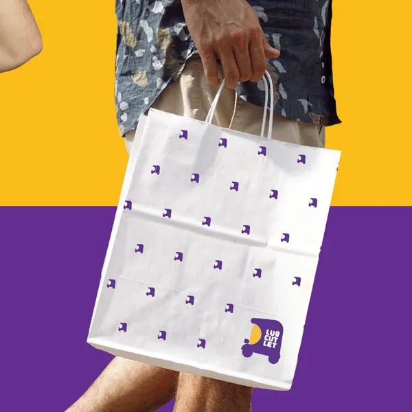
Pixpil also designed a comprehensive program of product packaging to avoid oil stains from customers and vehicle graphics for the cafe for communicating the love for cutlets and social evening experience, maintaining a clean and playful aesthetic throughout.